Shepard Fairey Gives the Rolling Stones a New Tongue Logo
FUSE TV - Shepard Fairey Gives the Rolling Stones a New Tongue Logo
If you've been using the same logo since 1971, you might get a little tired of looking at it, especially if it becomes a huge and inescapable piece of pop culture. That might explain why the Rolling Stones decided to commission a new version of their famous tongue to commemorate their 50th anniversary!
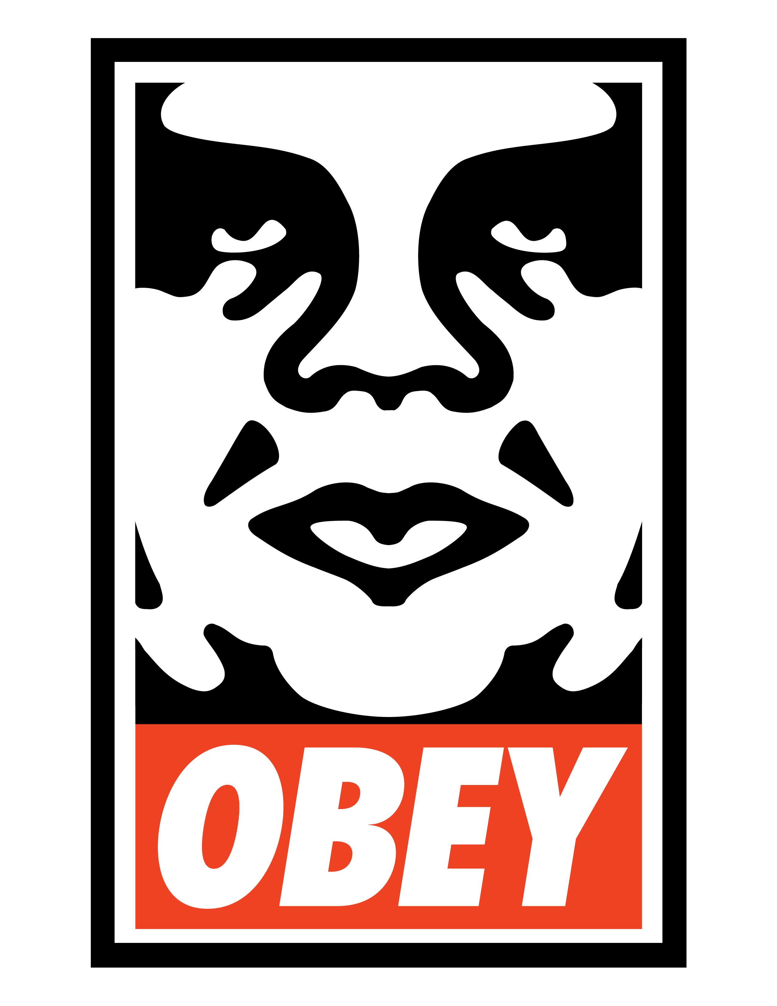
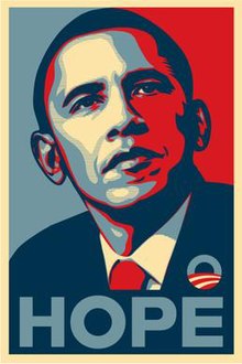
Shepard Fairey, the famed graffiti artist-turned-regular artist behind the legendary Andre the Giant/Obey campaign as well as Obama's "Hope" posters, has refashioned the band's logo with some slight recoloring and a "5" and a "0" replacing the "S" and "O" in Stones.
Personally, I feel like Fairey could have done a little more with this. It's basically the same thing! But what do you think of the new logo? Let us know in the comments.
13m
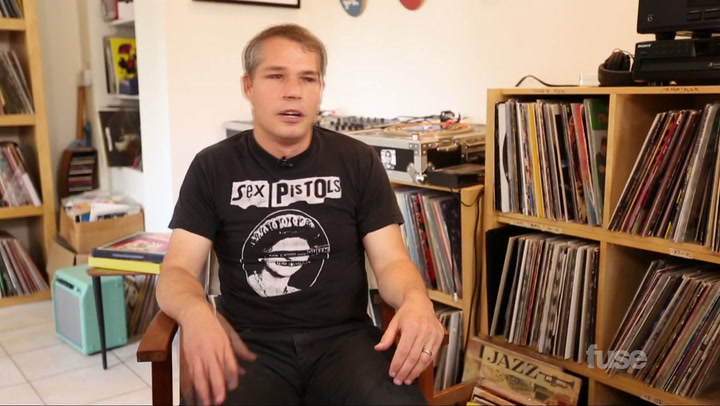
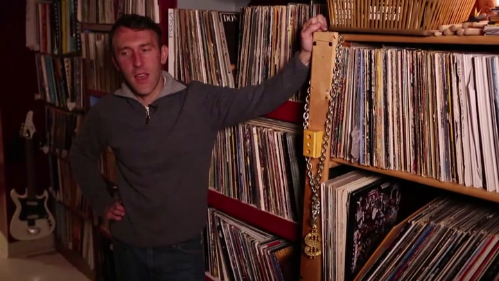
Shepard Fairey's Vinyl Collection
59m
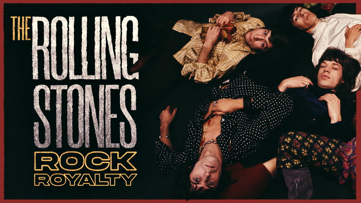
Rolling Stones: Rock Royalty
1h 25m
Little Stones
1m
Little Stones - Trailer
9m
Young M.A On The Struggle of Giving Up Meat
5m
G Fella Gives A Tour of The Bronx's Arthur Avenue
1m
This Is How A DCI Marimbist Rolls
46s
The DCI Struggles of Starting A New Summer
21m
Heads Will Roll
20m
Sticks, Stones and Breaking Bones

1h 39m
A New High
3m
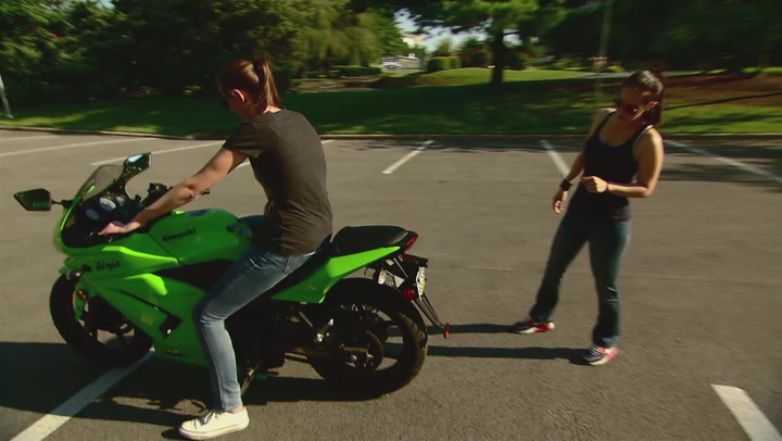
Casey Gives Her Girlfriend A Motorcycle Riding Rundown
2m
A New High - Trailer
2m
Yesenia Gives Financial Advice To Mia | Clash of The Corps
1m
The New York City Hustle
20m
Out With The Old, In With The New
43s
The Cadets and Their Spankin New Toys
6m
LGBTQIA Community, What Is The New Norm?
21m
New York, New York
1h 39m
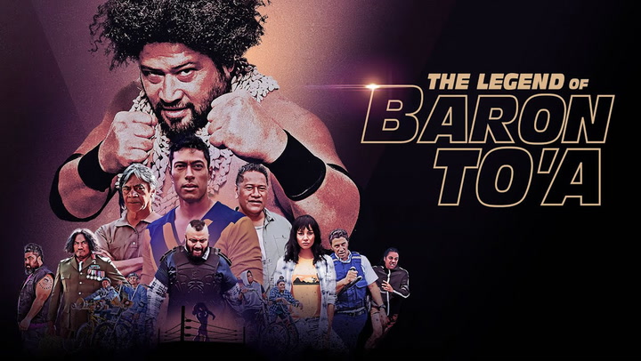
The Legend of Baron To'a
2m
The Unfortunate Mishap of A Sneakerhead
56s
New Generation
45m
New Blood
20m
New Beginnings
20m
Ernesto Yerena
3m
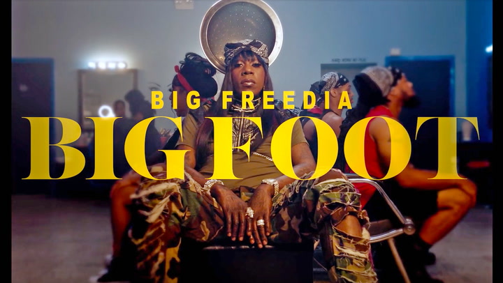
The Exclusive Premiere of Big Freedia's New Music Video, "BigFoot"
51s
Is Nya A Baller On The Low?
20m
The First Time, In A Long Time
1m
The Legend of Baron To'a - Trailer
44m
New Cage King
41m
A Quinceanera Dress That Last Beyond the Party
1m
The Fat Jewish Plays 2 Truths and a Lie
22m
New Girl In Town
21m
New Boss of Bounce
5m
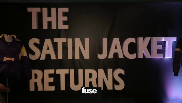
Beyoncé and A$AP Rocky Bring Back The Satin Jacket
2m
311s Chad Sexton Pays The Blue Devils Drumline A Visit
22m
New York Skate Of Mind
2m
King Keraun Falls Into a Sunken Place While in the Woods
18m
What The Hell Are We? Are We Living In A Simulation?
1m
What Does The Transcendent Star Look For In A Man: Dear Bambiana
1m
A Day In the Life of Wilmer Valderrama's Puppet Ep. 2: Optimism
1m
If Clash of the Corps Stars Could Role-Play For A Day
1m
A Day In the Life of Wilmer Valderrama's Puppet Ep. 1: Hollow Man
1h 45m
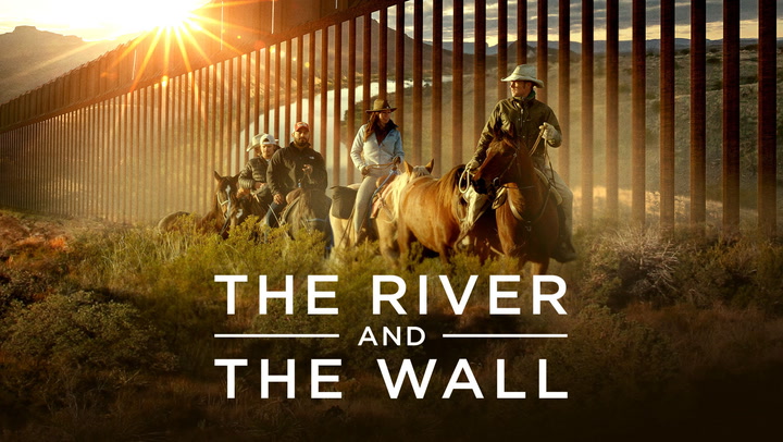
The River and the Wall
1m
A Day In the Life of Wilmer Valderrama's Puppet Ep. 3: Inner Thoughts
1h 2m
The Beatles: In the Life
24m
Once a Stripper, Always a Ho
1m
The Blue Devils Bring The Parade
2m
The Best of The Best Clash
1h 16m
A Sexplanation
20m
The Hustle
45m
The Reunion
44m
The Decision
21m
The Pilot
1h 27m
The Exchange
1h 20m
The FP
The Canvas
1h 34m
The Citizen
23m
The Motorcycle
The 212
1h 21m
The Feels
41m
A Glove That Fits Like a Dress
20m
It's Not a Vacation, It's a Movie
21m
All the Focus is on the Diamonds
1m
The Ladies Play "Fill In The Blanks"
4m
A$AP Ferg Learns A Magic Trick
10m
Peder Cho Shows How to DIY A Pair of Jeans into the Ultimate Y2K Mini Skirt
2m
The Hilarious Reality of the American Rat Race
22m
A Tough Sell

Like A Girl
20m
A Robot's Erection
59s
The 212 - Trailer
1h 22m
The Right Girls
23m
The Great Director
21m
Rock the Bells
22m
Behind The Snow
1h 36m
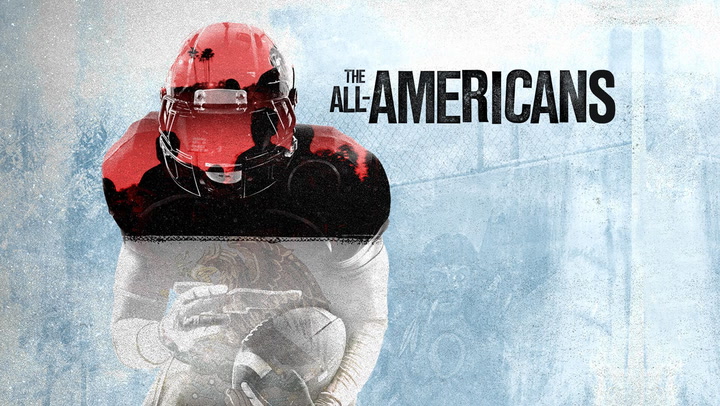
The All-Americans
48m
Meet The Jets
1h 3m
The Third Strike
44m
The Winner Is…
1h 25m
Strike a Pose
1h 42m
A Perfect 14
20m
Young M.A
20m
A$AP Ferg
1h 22m
Between the Shades
1h 30m
Crossed the Line
20m
Making The Retrograde
20m
The Vest Guest
21m
Enter the Metaverse
1h 7m
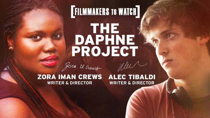
The Daphne Project
21m
Into The Woods
20m
Facing The Truth
57m
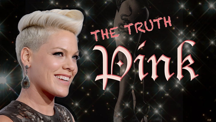
Pink: The Truth
1h 17m
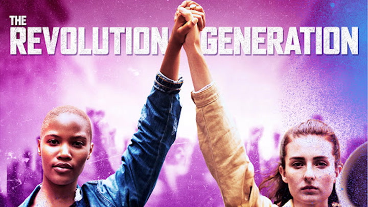
The Revolution Generation
20m
Rich The Kid
57s
The Read - Trailer
1h 15m
Cassandro, The Exotico!
20m
Create The Future
The Sex Clinic
22m


